Speeches Shim
FEATURED |
|---|
Analyzing Quantitative and Qualitative DataThese two short guides highlight useful techniques for analyzing performance data, serving as a quick source of reminders about the methods that might appropriate for particular performance indicators. |
The management implications of performance data are not always self-evident. Insightful data analysis and a compelling visual display of performance data can help spur achievement and make the need for changes in a strategy patently obvious.
This short guide highlights useful techniques for analyzing performance data, serving as a quick source of reminders about the methods that might be appropriate for particular performance indicators.
Understanding Performance Data
Performance data presented in tables that compare planned to actual performance one indicator at a time are sufficient for meeting the most basic performance reporting requirements.
| Indicators | 2009 | 2010 | 2011 | 2012 | 2013 | |
|---|---|---|---|---|---|---|
| Inspectors | Planned | 600 | 650 | 700 | 750 | |
| Actual | 580 | 638 | 701 | 771 | ||
| Shipments | Planned | 20,000 | 30,000 | 40,000 | 50,000 | |
| Actual | 23,200 | 38,000 | 53,700 | 74,300 | ||
In this basic form, however, these data do not necessarily reveal everything a Mission needs to understand performance. The implications of many indicators become clearer when, in addition to presenting raw data on changes in the indicator status, a data analysis plan calls for calculating the rate at which change is occurring for key indicators. In addition to looking at performance one indicator at a time, the data analysis section of a PMP should also explain how data from 2-3 different indicators for a single result will be analyzed together to produce an integrated picture of progress towards that results. Since results are linked in chains of hypotheses, the analysis of performance data should include a vertical review of the status of these links as well as the kind of horizontal look at performance that tables like the one above provide.
By way of example, if a PMP analysis plan for the data in the table above called for a joint analysis of the two indicators – for the purpose of understanding an “improved effectiveness” result – it might have called for a simple ratio to be calculated. When that is done, the combined implication of the two indicators is that things may be getting worse, even though progress looked good, one indicator at a time.
| Inspectors to Shipment Ratio | 2009 | 2010 | 2011 | 2012 | 2013 |
|---|---|---|---|---|---|
| 1:40 | 1:60 | 1:76 | 1:96 |
Communicating the Management Implications of Performance Data
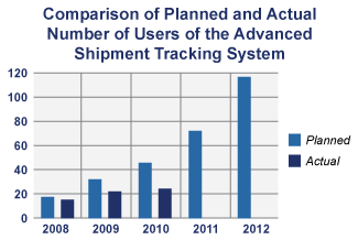
 While data tables are an important device for recording and reporting performance data, they are not always the most effective way to get performance messages acrossin team meetings or with partners. Graphic displays can speed up communications and stimulate efforts to improve performance. Including expectations about data presentation as well as data analysis in a PMP can help encourage the utilization of performance data
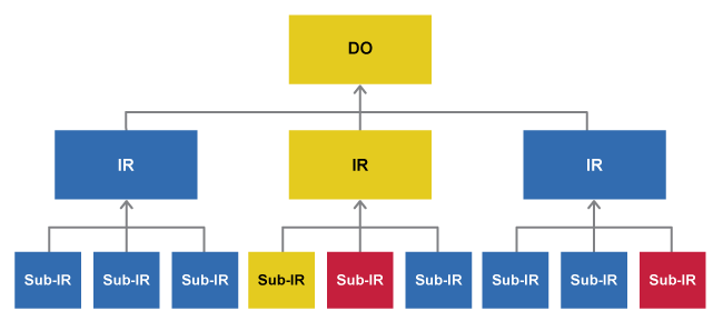
Graphic representations of performance data messages also help senior Mission managers understand where, across a portfolio, performance data indicate the need for management action. In one USAID/Africa Mission where the senior staff perceived itself to be awash in performance indicators but unable to use them to get a grip on how to use this information to manage performance, the M&E team approached the problem visually, first reviewing all of the Indicators for each result as a group, and then color coding the messages that performance data on those indicators were sending. The answer. Blue = on track; Yellow = performance issues; Red = achievement of the result is at risk.

| << Data Sources | Up | Frequency, Schedule and Responsibilities >> |
ProjectStarterBETTER PROJECTS THROUGH IMPROVED |
A toolkit developed and implemented by: For more information, please contact Paul Fekete. |

Comment
Make a general inquiry or suggest an improvement.